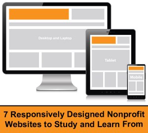
 At least 15% of all traffic to nonprofit’s websites now occur on mobile devices and across all sectors mobile is set to surpass desktop browsing in 2014. Over the last few years as I have studied the rapid rise of the Mobile Web, I have become more of an advocate of launching a responsively designed website over launching a mobile site separate from a desktop site. Many nonprofits do not currently have the financial means to launch a new website, so a separate mobile website is a good interim solution. However, those nonprofits that are in the process of launching a new website or considering it, ensuring that it is responsively designed would be a wise step forward for your nonprofit’s future.
That said, last week I received an email from large national nonprofit announcing that they had launched a new website. Before even reviewing the site on my laptop, my first instinct was to grab my smartphone and tap the website URL into my mobile browser to see if their new site was responsively designed. Sadly, it was not. How is it that a large national nonprofit and the consultants, the design firm, and the web and graphic designers on the project did not take into serious consideration the rapid growth of browsing on tablets and smartphones?
Even more baffling, this nonprofit hosts multiple fundraising events each year at locations around the United States and has a huge Facebook and Twitter following. The nonprofit won’t be able use their new website to communicate with supporters at these events because their website is essentially unreadable on a smartphone (no back up separate mobile website) and every time they post links to their new website on social networking sites, their smartphone-based fans and followers won’t be able to read their website inside of Facebook, Twitter, Google+, etc. With Facebook mobile users now surpassing desktop users… have you ever clicked on a link to your desktop site inside of Facebook, Twitter or Google+ on a smartphone? Doing so will illuminate why responsively designed websites (or adaptively designed websites – here’s the difference) are becoming more essential to be successful online.
Nonprofits please don’t make the same mistake with your next website launch. Study and learn from the nonprofits listed below who had some foresight, got some good advice, and launched responsively designed websites:
1. African Wildlife Foundation :: awf.org
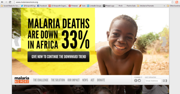
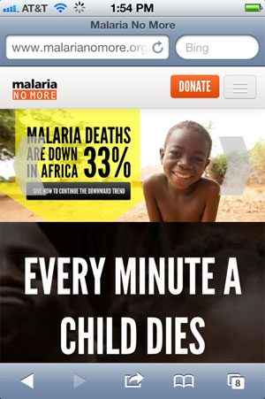
2. Malaria No More :: malarianomore.org
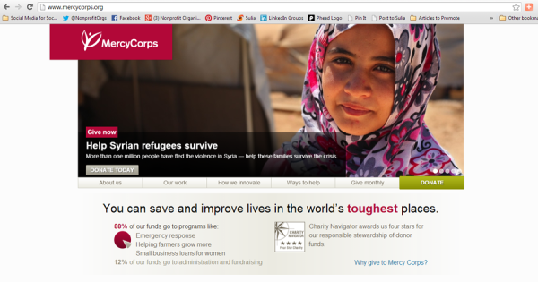
3. Mercy Corps :: mercycorps.org
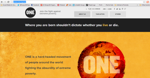
4. ONE :: one.org
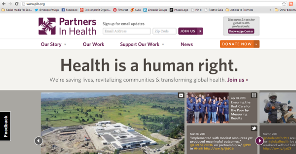
5. Partners in Health :: pih.org
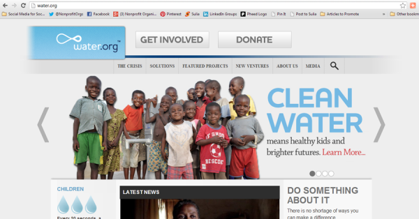
6. Water.org :: water.org
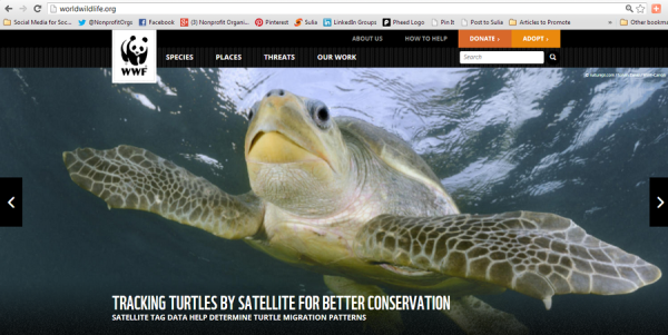
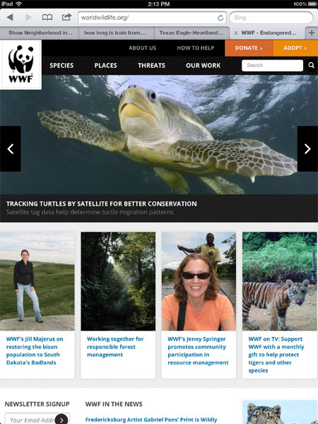
7. World Wildlife Fund :: worldwildlife.org
Finally, if your nonprofit has recently launched a responsively designed website, please post the link in a comment below. I’m always glad to find nonprofits that are pioneering the Mobile Web,
Related Links:
5 Reasons Why Your Nonprofit Should Prioritize the Mobile Web in 2013
[INFOGRAPHIC] 2013: The Year of Responsive Design
The Difference Between Adaptive and Responsive Web Design
Webinar: Mobile Communications and Mobile Fundraising for Nonprofits (Live)
Webinar: Mobile Communications andMobile Fundraising for Nonprofits (On-Demand)


